


 Sameer Siddiqui
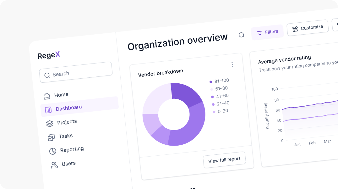
In today's data-driven world, dashboards are vital tools for businesses to monitor, analyze, and make decisions based on real-time data.
An intuitive dashboard enhances decision-making, improves efficiency, and boosts user satisfaction. Here's why building an intuitive dashboard is important and how you can achieve it using practical tips.
Clear Visual Hierarchy
Establish a clear visual hierarchy using different font sizes, weights, and colors to distinguish between primary and secondary information. This helps users quickly identify the most important information and understand the relationships between different data points.
Implement Effective Visual Patterns
Utilize consistent patterns and design elements to create a cohesive and intuitive interface. Consistency in design patterns reduces the learning curve for users. When elements behave in predictable ways, users can navigate and interact with the dashboard more intuitively.
Apply visual cues like borders, shading, and whitespace to separate distinct sections. Visual cues such as borders and whitespace help in segregating different sections, making the layout cleaner and preventing information overload. This enhances focus and clarity.
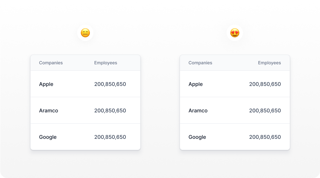
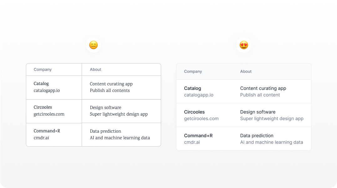
Add zebra stripes
Alternating different color backgrounds for each row is another good way to help users keep their place while reading.
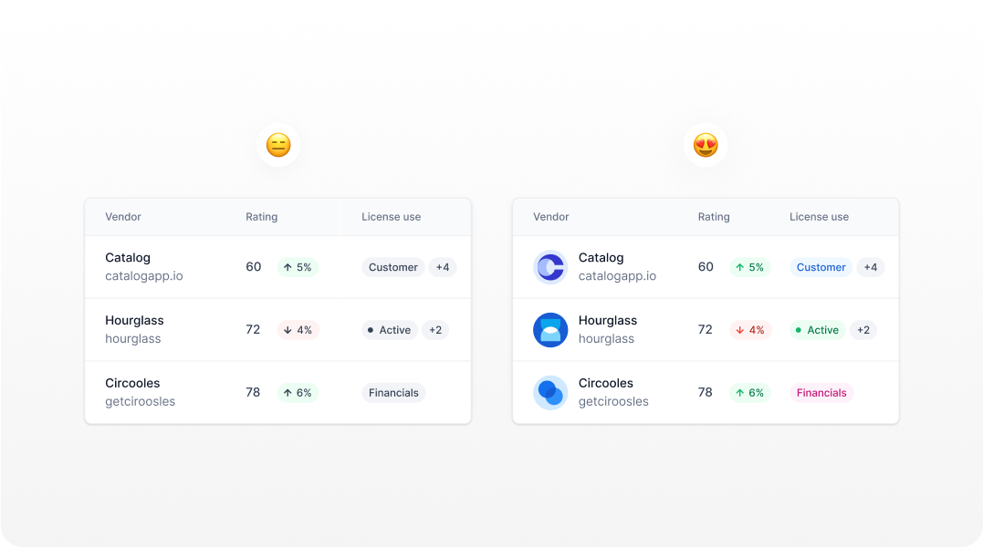
Make use of Colors
Leverage color to highlight important information and guide user attention. Color can draw attention to key data points and guide users through the dashboard. Thoughtful use of color can improve information hierarchy and highlight critical information.
Maintain a consistent color palette that aligns with the brand and ensures accessibility. A consistent color palette strengthens brand identity and ensures a cohesive visual experience. Ensuring color accessibility (e.g., color contrast ratios) makes the dashboard usable for color-blind users.
Text & Numeric Values Alignment
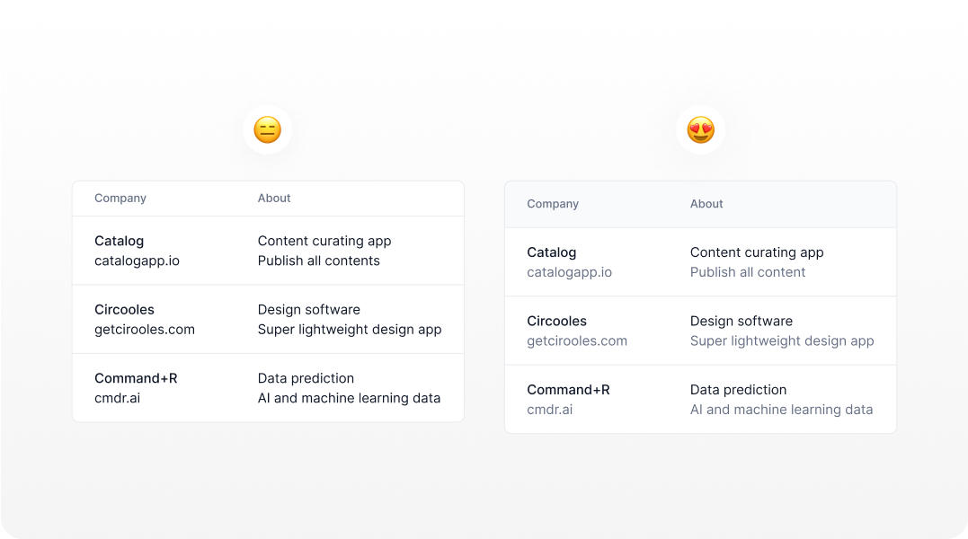
Ensure that text elements are left-aligned for better readability. The left alignment of text makes it easier for users to read and scan information, as our eyes naturally move from left to right. This principle enhances readability and reduces cognitive load. Align numeric values to the right to facilitate comparison and scanning.
The right alignment of numeric values allows users to easily compare figures, as it creates a straight edge that simplifies scanning down a column of numbers.
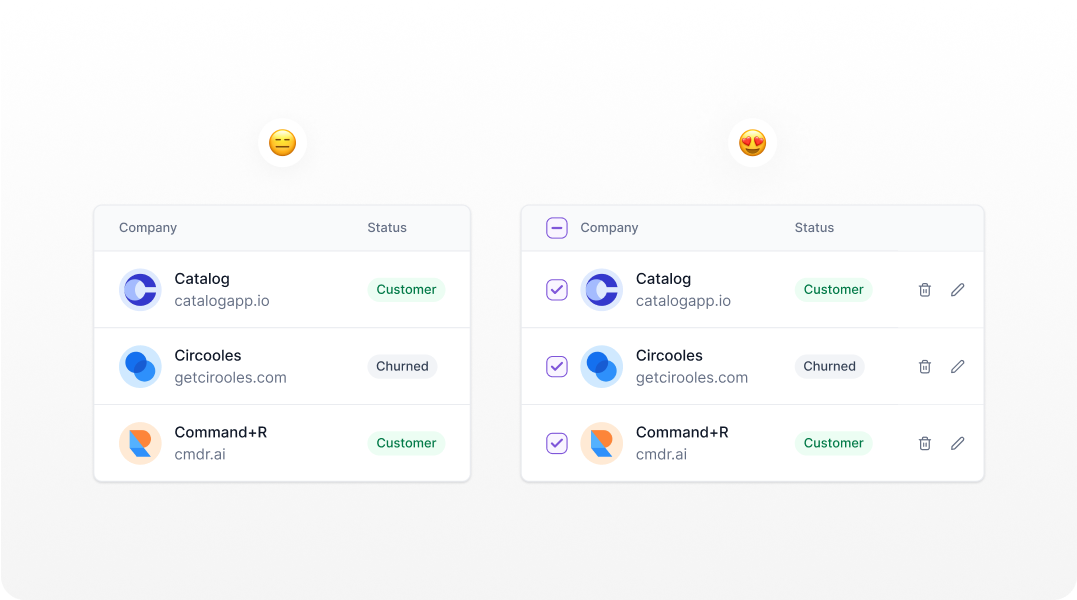
Keep Common Actions Visible
It facilitates rapid understanding, enabling users to grasp information efficiently and swiftly make informed decisions, thereby saving valuable time and expediting the process of taking action.
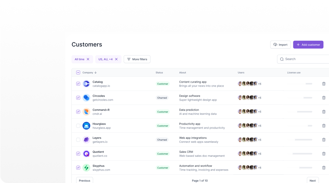
Allow users to sort, search and filter data
Allow users to customize their dashboards by rearranging widgets and selecting preferred data views. Customization empowers users to tailor the dashboard to their specific needs, improving relevance and satisfaction.
Provide options for saving personalized settings and configurations. Personalized settings ensure that users can return to their preferred dashboard configurations, enhancing convenience and user engagement.
Enhance Readability with Font Choices
Select fonts that offer high readability and a neutral tone, such as sans-serif fonts for clarity. Readable fonts ensure that users can easily read and comprehend text without strain. Sans-serif fonts are often preferred for digital interfaces due to their clean and modern appearance.
Ensure sufficient contrast between text and background to improve legibility. Adequate contrast between text and background enhances legibility, making it easier for users to read content, especially in low-light conditions or for users with visual impairments.
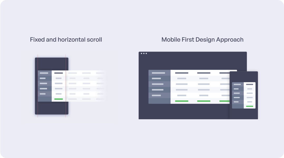
Table Responsiveness
Design with mobile devices in mind first, ensuring that the layout is responsive and adaptable to various screen sizes. A mobile-first approach ensures that the dashboard is usable across all devices, providing a consistent experience. With the increasing use of mobile devices, this approach prioritizes accessibility and usability.
Prioritize touch-friendly elements and consider thumb zones for ease of use on mobile devices. Touch-friendly design elements enhance usability on mobile devices, ensuring that users can interact with the dashboard comfortably. Considering thumb zones ensures that important elements are easily reachable.
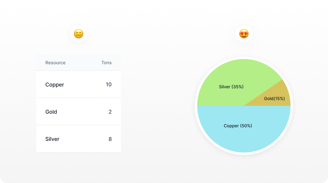
Optimize Information Display
Use visualizations like charts, graphs, and infographics to represent data in an easily digestible format. Avoid clutter by focusing on essential information and employing progressive disclosure for additional details.
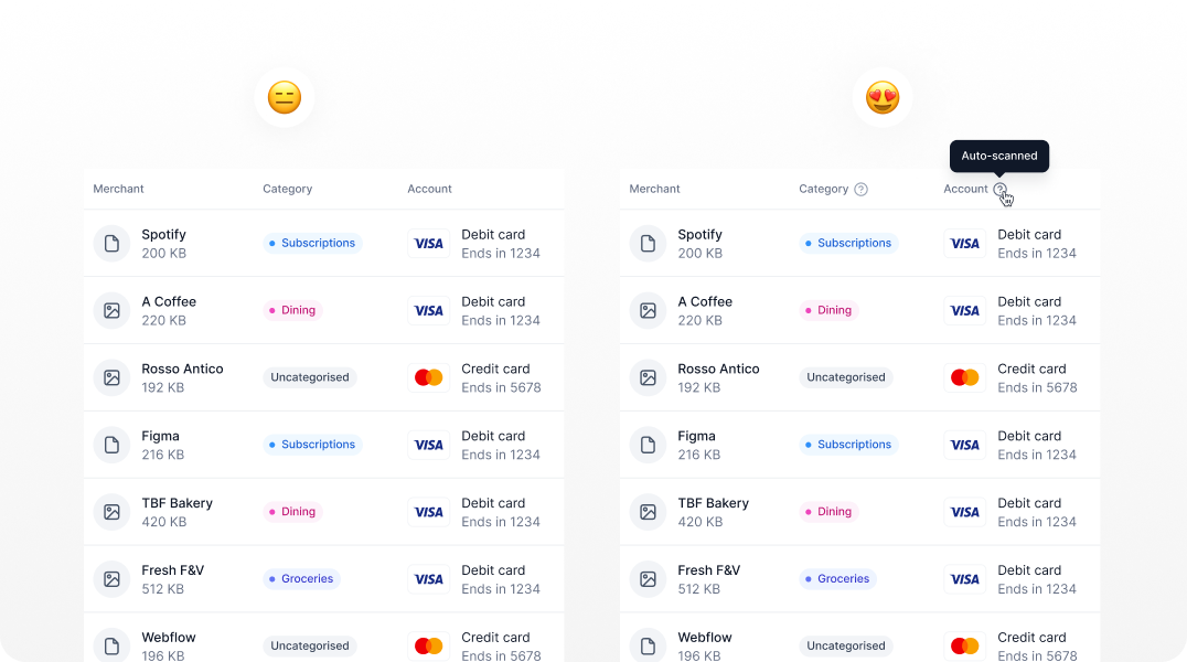
Provide Contextual Help and Tooltips
Include tooltips and contextual help to assist users in understanding complex data or unfamiliar features. Contextual help and tooltips offer immediate guidance without disrupting the user experience.
They help users understand complex features and data, improving usability. It ensures that help options are easily accessible without disrupting the user experience. Easily accessible help options support users in navigating and understanding the dashboard, enhancing their overall experience.